
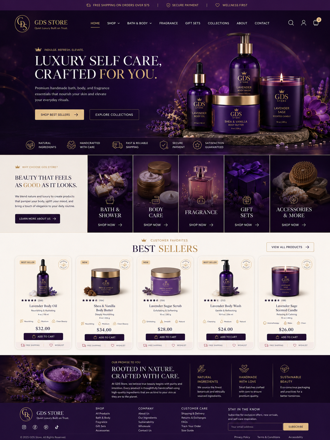
Building the GDS Store Homepage in Avada — Step-by-Step
Pairs with avada-homepage-custom.css. Unlike the Shop Archive page, the homepage is a normal Page, not a Theme Builder archive type — build it directly with Fusion Builder on the actual “Home” page in WordPress.
1. Hero section
- Add a full-width Container
- Background: Radial Gradient — center point around 78% horizontal / 45% vertical, colors
#4a2c52→#2a1830→#1c0f1e - Container CSS class:
home-hero - Two columns (roughly 1.05fr / 1fr):
- Left: crown eyebrow text (“Indulge. Refresh. Elevate.”), a Fusion Title element for the headline (wrap “for you.” in a
<span class="accent-word">via the Title element’s HTML view), a Text Block for the paragraph, then a small Button row (2 buttons: solid gold “Shop Best Sellers”, outline cream “Explore Collections”) - Right: your hero product photography (once available) — a single well-lit flat-lay or grouped product shot works best here, matching the reference image’s soft glow/vignette
- Left: crown eyebrow text (“Indulge. Refresh. Elevate.”), a Fusion Title element for the headline (wrap “for you.” in a
- Below the two columns, inside the same container, add a row with CSS class
hero-trust-rowcontaining an Icon List with 5 items: Natural Ingredients, Handcrafted With Care, Fast & Reliable Shipping, Secure Payment, Satisfaction Guaranteed
2. “Why Choose GDS Store” split section
This is a 2-part layout: a narrower text column + a 5-tile category grid.
- Add a full-width Container with no padding, set to a 1/4 + 3/4 column split (Fusion Builder lets you set a custom ratio close to 1:2.4 if you want it tighter)
- Left column (
why-copyclass): background#f3ecdf, padded generously (~60px), containing the eyebrow, heading, paragraph, and a dark “Learn More About Us” button - Right column: nest 5 equal sub-columns inside it, each one:
- Given the CSS class
cat-tile - Background image = the category’s representative photo (Bath & Shower, Body Care, Fragrance, Gift Sets, Accessories), set via the column’s Background Image option
- Content: a small icon, the category name, and a “Shop Now →” link, all bottom-aligned (the CSS handles the dark gradient overlay so text stays legible over the photo)
- Given the CSS class
3. Best Sellers section
- Add a full-width Container, class
best-sellers-section, cream background, generous top/bottom padding - Section header: eyebrow + centered Title (“Best Sellers” — wrap “Sellers” in
.accent-word), plus a “View All Products” button positioned top-right (Fusion Builder: set the button element’s container toposition: relativeand use the.view-all-btnclass with absolute positioning, or simpler — just place it as a normal right-aligned element in a 2-column header row) - Below the header, add the Woo Shortcode element with the
if you want exact control over which 5 show -
- This reuses the same card CSS from the shop page’s custom CSS file — no new card styling needed here, just the section-level header rules
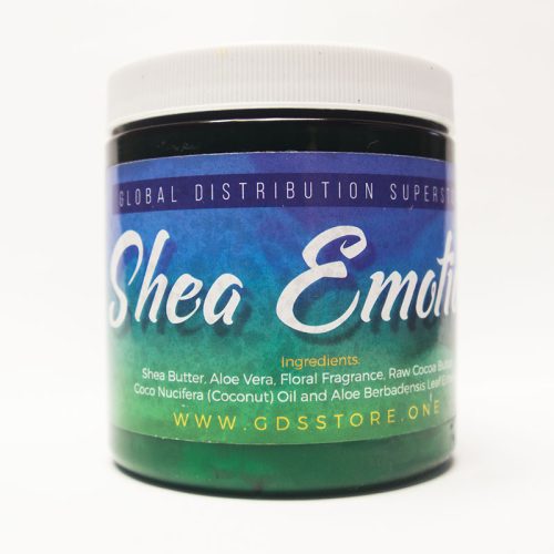

Optional “Premium Quality” seal: the small circular badge in the top right of each card isn’t native — either skip it, or add it via the same badge/label plugin used for “Best Seller”/”New” tags, using the .quality-seal class from the CSS file as your styling target once you know what markup the plugin outputs.
4. “Rooted in Nature” promise banner
- Full-width Container, class
promise-banner, gradient background#1c0f1e→#3a2140 - Two columns (roughly 1fr / 1.7fr):
- Left: a single image (lavender/product flat-lay)
- Right: nest 4 sub-columns — first one wider (headline + intro paragraph), the remaining three each holding one icon + heading + short description (Natural Ingredients, Handmade With Love, Sustainable Beauty)
5. Footer
Same global footer as the shop page — no separate build needed if you’ve already set this up in Theme Builder’s Footer layout.
6. Apply the CSS
Append the full contents of avada-homepage-custom.css into the same Theme Options > Custom CSS panel, below the shop page CSS. Since both files declare the same :root variables block, you can safely delete the second :root{ } block when combining them — keep only one.
7. Test checklist
- [ ] Hero headline wraps cleanly at tablet/mobile widths (long uppercase serif text can overflow on narrow screens — check this first)
- [ ] Category tiles remain legible — text-over-photo needs the gradient overlay to hold contrast; verify with your actual photography, not just placeholder colors
- [ ] Best Sellers shortcode pulls the correct 5 products and Add to Cart works inline
- [ ] Promise banner’s 3-column icon row doesn’t cramp on tablet (CSS collapses it to a single column under 800px)
- [ ] All CTAs (Shop Best Sellers, Explore Collections, Learn More, Shop Now, View All Products) point to the correct pages